The color wheel is a circular diagram illustrating color relationships. It organizes colors from primary to tertiary‚ aiding in mixing and creating harmonious palettes. Essential for artists and designers‚ it helps select color combinations that evoke desired moods and aesthetics.
1.1 What is a Color Wheel?
A color wheel is a circular chart that displays colors systematically. It is divided into primary‚ secondary‚ and tertiary colors‚ showing how they relate and mix. This tool helps visualize color harmony‚ contrasts‚ and gradients‚ making it essential for artists‚ designers‚ and anyone working with color. By organizing colors in a logical sequence‚ the wheel simplifies the process of creating cohesive color schemes and understanding color theory fundamentals.
1.2 Importance of the Color Wheel in Mixing Colors
The color wheel is pivotal for predicting color mixtures. It visually maps primary‚ secondary‚ and tertiary colors‚ enabling the creation of harmonious palettes. By understanding complementary‚ analogous‚ and triadic relationships‚ artists can mix colors effectively. This tool aids in avoiding mismatches and ensures desired hues‚ making it indispensable for precise color creation and artistic expression across various mediums‚ from painting to fashion and design.
Primary Colors
Primary colors are red‚ blue‚ and yellow‚ the foundational hues in color theory that cannot be created by mixing others. They are the base for all color mixing and are positioned equally around the color wheel‚ forming the starting point for creating a wide range of hues.
2.1 Definition of Primary Colors
Primary colors are the three fundamental hues—red‚ blue‚ and yellow—essential in color theory. They cannot be created by mixing other colors and serve as the building blocks for all other colors. These pure‚ vivid tones are placed equally around the color wheel‚ forming the foundation for understanding color relationships and mixing. Their uniqueness lies in their inability to be derived from any combination of other pigments‚ making them indispensable in art and design.
2.2 How Primary Colors Form the Basis of the Color Wheel
Primary colors—red‚ blue‚ and yellow—are positioned equally around the color wheel‚ forming its core. These fundamental hues cannot be created by mixing others and are the starting point for generating secondary and tertiary colors. By mixing primary colors‚ secondary colors like green‚ orange‚ and purple are produced‚ while tertiary colors emerge from blending primary and secondary hues. This systematic arrangement allows for understanding color relationships‚ harmonies‚ and mixing principles‚ making primary colors the foundation of the color wheel’s structure and functionality in design and art.

Secondary Colors
Secondary colors—orange‚ green‚ and purple—are created by mixing two primary colors. They are positioned between their parent primaries on the color wheel‚ forming vibrant and essential hues.
3.1 Creating Secondary Colors by Mixing Primaries
Secondary colors are formed by mixing two primary colors. Red and blue create purple‚ blue and yellow produce green‚ and red and yellow make orange. These vibrant hues are essential in color theory and design‚ offering a wide range of creative possibilities. The process of mixing primaries to achieve secondary colors is fundamental‚ as it builds the foundation for understanding more complex color combinations and harmonies in the color wheel.
3.2 Understanding the Position of Secondary Colors on the Wheel
Secondary colors—orange‚ green‚ and purple—are positioned between the primary colors that create them on the color wheel. Orange lies between red and yellow‚ green between blue and yellow‚ and purple between blue and red. This arrangement visually represents how each secondary color is formed by mixing its adjacent primaries. Their placement helps in understanding color harmony principles‚ such as complementary and analogous relationships‚ which are essential for effective color combinations in art and design.
Tertiary Colors
Tertiary colors are created by mixing primary and secondary colors‚ resulting in hues like yellow-green or blue-violet. They expand the color spectrum‚ offering richer‚ more complex shades.
4.1 What Are Tertiary Colors?
Tertiary colors are created by mixing a primary color with a secondary color‚ resulting in hues like yellow-green‚ blue-green‚ blue-violet‚ red-violet‚ red-orange‚ and yellow-orange. These colors are intermediate and offer a wider range of possibilities for creating complex and nuanced color schemes. Tertiary colors are essential in color theory‚ as they provide depth and variety‚ allowing for richer and more intricate designs in art‚ fashion‚ and home décor. They are a key component of the color wheel‚ enhancing its versatility.
4.2 How Tertiary Colors Expand the Color Wheel
Tertiary colors expand the color wheel by introducing intermediate hues‚ creating a broader spectrum of possibilities. These colors‚ formed by mixing primary and secondary colors‚ add depth and variety to the wheel. They provide artists and designers with a richer palette‚ enabling more nuanced and complex color combinations. This expansion enhances creativity and practical applications‚ offering a wider range of options for achieving specific visual effects in art‚ fashion‚ and design. Tertiary colors bridge gaps between primary and secondary hues‚ fostering versatility.
Color Harmony Principles
Color harmony principles guide the selection of colors that create balanced and aesthetically pleasing combinations. These principles‚ like complementary‚ analogous‚ and triadic colors‚ help artists and designers achieve visual coherence.
5.1 Complementary Colors
Complementary colors are pairs located opposite each other on the color wheel. When combined‚ they create high contrast and vibrant effects‚ making each color appear brighter. This technique is often used in art and design to draw attention or create dynamic visuals. For example‚ blue and orange are complements‚ producing a striking contrast when used together. This principle enhances visual impact and adds energy to compositions. It’s a key element in achieving color harmony.
5.2 Analogous Colors
Analogous colors are neighboring hues on the color wheel‚ creating smooth transitions and harmony. They are ideal for cohesive designs‚ reducing visual clutter. In art‚ they build subtle gradients and depth. Fashion and home décor use them for a coordinated look. Adding a complementary color can introduce contrast. This technique ensures a balanced‚ visually appealing result‚ enhancing creativity across various fields.
5.3 Triadic Colors
Triadic colors are three hues evenly spaced around the color wheel‚ forming a vibrant triangle. They create bold contrast and energy‚ making them ideal for dynamic designs. Examples include red‚ yellow‚ and blue. These colors can overpower if overused‚ so balance is key. Often‚ one color dominates while others act as accents. This scheme is popular in art and design for its striking visual impact and ability to evoke strong emotions‚ enhancing creativity and aesthetics effectively.

Tints‚ Tones‚ and Shades
Tints‚ tones‚ and shades expand a color’s versatility. Tints (adding white)‚ tones (adding gray)‚ and shades (adding black) create depth and variety in color schemes‚ enhancing visual appeal.
6.1 Understanding Tints
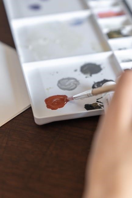
Tints are created by adding white to a base color‚ making it lighter and less intense. This process softens the hue and increases brightness‚ producing a pastel effect. Tints are often used in art‚ fashion‚ and home décor to create delicate‚ calming palettes. They can also enhance contrast when paired with darker shades‚ offering versatility in design. Understanding tints allows for precise control over color intensity‚ enabling the creation of subtle‚ harmonious color schemes.
6.2 Understanding Tones
Tones are created by adding gray to a base color‚ reducing its brightness and saturation. This process mutes the color‚ making it less intense while preserving its core hue. Tones are widely used in art‚ fashion‚ and interior design to balance and harmonize palettes. They add depth and versatility to designs‚ allowing for subtle variations that can enhance or neutralize other colors. Understanding tones enables precise control over color intensity‚ facilitating the creation of sophisticated‚ balanced visual compositions.
6.3 Understanding Shades
Shades are created by adding black to a base color‚ darkening it and reducing its lightness. This deepens the color‚ making it richer and more dramatic. Shades are used in art‚ fashion‚ and home décor to add depth and contrast. They help create dimension in designs and can evoke powerful emotions. By altering a color’s lightness‚ shades provide versatility and enhance visual interest‚ making them a valuable tool for designers and artists seeking to add complexity to their work.
Practical Applications of the Color Wheel
The color wheel is widely used in art‚ fashion‚ and home décor to create harmonious color schemes. It helps artists mix colors effectively and designers select visually appealing palettes.
7.1 Using the Color Wheel in Art
The color wheel is an indispensable tool for artists‚ enabling them to mix colors accurately and create harmonious palettes. By understanding primary and secondary colors‚ artists can predict tints‚ tones‚ and shades. It aids in selecting complementary or analogous colors for dynamic compositions. This visual guide helps artists achieve balance and evoke specific moods in their work‚ making it essential for both traditional and digital art creation.
7.2 Using the Color Wheel in Fashion
Fashion designers rely on the color wheel to create cohesive collections. It helps in selecting complementary and analogous colors‚ ensuring outfits are visually appealing. By understanding warm and cool tones‚ designers can craft palettes that flatter various skin tones. The wheel also guides in mixing dyes for fabrics‚ ensuring colors remain consistent and vibrant. This tool is essential for predicting trends and creating stylish‚ harmonious looks that resonate with consumers.
7.3 Using the Color Wheel in Home Décor
The color wheel is invaluable for home décor‚ helping to create harmonious spaces. It aids in selecting complementary and analogous colors for walls‚ furniture‚ and accents. By understanding color temperature‚ homeowners can craft balanced palettes that reflect desired moods‚ from calming to energizing. The wheel also guides in mixing paint hues and coordinating textiles‚ ensuring a cohesive and aesthetically pleasing environment that enhances the beauty of any room.

Tools for Color Mixing
The color wheel is a key tool for color mixing‚ available as physical charts or digital apps. Both versions help in understanding color relationships and creating harmonious palettes.
8.1 Physical Color Wheels
Physical color wheels are portable‚ durable tools ideal for artists‚ designers‚ and educators. Available in various formats‚ including charts‚ foldable guides‚ and pocket-sized versions‚ they provide instant visual references. These wheels display primary‚ secondary‚ and tertiary colors‚ along with tints‚ tones‚ and shades. They are especially useful for hands-on learning and offline use‚ offering a tactile experience that enhances understanding of color relationships and mixing principles. Many are compact‚ making them easy to carry for quick reference.
8.2 Digital Color Wheel Tools
Digital color wheel tools offer interactive and versatile ways to explore color relationships. Available online or as apps‚ they allow users to generate color combinations in real-time. These tools often include features like sliders for adjusting hues‚ saturation‚ and brightness. Many support multiple color models‚ such as RGB and CMYK‚ making them suitable for both artistic and professional use. Digital wheels also provide hex codes for precise color replication‚ making them indispensable for graphic designers‚ web developers‚ and digital artists.

Limitations of the Color Wheel
The color wheel has limitations‚ such as color bias and challenges in exact reproduction. It serves as a guide but may not always predict precise color outcomes.
9.1 Understanding Color Bias
Color bias refers to how hues lean toward adjacent colors on the wheel‚ affecting mixing results. This variation occurs because pure pigments rarely exist‚ leading to shifts in expected outcomes. For instance‚ a “red” pigment might lean toward orange or purple‚ altering the final color produced. This inconsistency challenges precise color reproduction and highlights the need for adjustment when predicting mixing outcomes. Understanding bias is crucial for achieving desired hues in both physical and digital color systems.
9.2 The Challenges of Exact Color Reproduction
Exact color reproduction is challenging due to variations in perception‚ light conditions‚ and medium limitations. Colors may appear differently under natural vs. artificial light‚ and pigments often lack the purity required for precise mixing. Additionally‚ color models like CMYK and RGB have distinct gamuts‚ making translation between them imperfect. These factors highlight why the color wheel serves as a guide rather than a guarantee for exact color outcomes in practical applications.
Since the conclusion should wrap up the entire guide‚ I need to summarize the importance of the color wheel without going into the details that were already covered. I should highlight its role as a foundational tool‚ its versatility across different fields‚ and perhaps mention the balance between creativity and technical understanding it provides. It’s also good to encourage the reader to apply the knowledge they’ve gained.
I also need to ensure that the language is clear and concise‚ fitting everything into exactly . I’ll start by stating that the color wheel is a fundamental tool‚ then mention its role in understanding color relationships‚ harmony‚ and mixing. I’ll touch on its applications in various creative fields and perhaps note that mastering it enhances one’s ability to work with colors effectively. Finally‚ I’ll conclude by emphasizing that consistent practice leads to better results.
Let me draft a possible conclusion:
The color wheel is a fundamental tool in color theory‚ essential for understanding color relationships‚ harmony‚ and effective mixing. It aids artists‚ designers‚ and creators in selecting complementary‚ analogous‚ and triadic color schemes‚ enhancing the visual appeal of their work; Whether in art‚ fashion‚ or home décor‚ the color wheel serves as a versatile guide. By mastering it‚ one gains a deeper understanding of color dynamics‚ enabling the creation of balanced and impactful palettes. Consistent practice with the color wheel ensures successful and visually appealing color combinations;
Now‚ I’ll check the word count to make sure it’s exactly . Let’s count:
The
color
wheel
is
a
fundamental
tool
in
color
theory‚
essential
for
understanding
color
relationships‚
harmony‚
and
effective
mixing.
It
aids
artists‚
designers‚
and
creators
in
selecting
complementary‚
analogous‚
and
triadic
color
schemes‚
enhancing
the
visual
appeal
of
their
work.
Whether
in
art‚
fashion‚
or
home
décor‚
the
color
wheel
serves
as
a
versatile
guide.
By
mastering
it‚
one
gains
a
deeper
understanding
of
color
dynamics‚
enabling
the
creation
of
balanced
and
impactful
palettes.
Consistent
practice
with
the
color
wheel
ensures
successful
and
visually
appealing
color
combinations.
Hmm‚ that’s ‚ which is over the limit. I need to trim it down to without losing the essential information. Let me revise:
The color wheel is a fundamental tool in color theory‚ essential for understanding color relationships and effective mixing. It aids creators in selecting harmonious color schemes‚ enhancing their work’s visual appeal. Whether in art‚ fashion‚ or home décor‚ the color wheel serves as a versatile guide. Mastering it deepens one’s understanding of color dynamics‚ enabling the creation of balanced palettes. Consistent practice ensures successful and visually appealing color combinations.
Now‚ let’s count again:
The
color
wheel
is
a
fundamental
tool
in
color
theory‚
essential
for
understanding
color
relationships
and
effective
mixing.
It
aids
creators
in
selecting
harmonious
color
schemes‚
enhancing
their
work’s
visual
appeal.
Whether
in
art‚
fashion‚
or
home
décor‚
the
color
wheel
serves
as
a
versatile
guide.
Mastering
it
deepens
one’s
understanding
of
color
dynamics‚
enabling
the
creation
of
balanced
palettes.
Consistent
practice
ensures
successful
and
visually
appealing
color
combinations.
That’s ‚ which is under the required 76. I can add a bit more to reach the word count without redundancy. Let me add a sentence about the color wheel being a starting point for creativity:
The color wheel is a fundamental tool in color theory‚ essential for understanding color relationships and effective mixing. It aids creators in selecting harmonious color schemes‚ enhancing their work’s visual appeal. Whether in art‚ fashion‚ or home décor‚ the color wheel serves as a versatile guide. Mastering it deepens one’s understanding of color dynamics‚ enabling the creation of balanced palettes. It also serves as a starting point for exploring creativity. Consistent practice ensures successful and visually appealing color combinations.
Now‚ let’s count:
The
color
wheel
is
a
fundamental
tool
in
color
theory‚
essential
for
understanding
color
relationships
and
effective
mixing.
It
aids
creators
in
selecting
harmonious
color
schemes‚
enhancing
their
work’s
visual
appeal.
Whether
in
art‚
fashion‚
or
home
décor‚
the
color
wheel
serves
as
a
versatile
guide.
Mastering
it
deepens
one’s
understanding
of
color
dynamics‚
enabling
the
creation
of
balanced
palettes.
It
also
serves
as
a
starting
point
for
exploring
creativity.
Consistent
practice
ensures
successful
and
visually
appealing
color
combinations.
Now‚ it’s ‚ which is still over. I need to be more concise. Let me remove “whether” and rephrase:
The color wheel is a fundamental tool in color theory‚ essential for understanding color relationships and effective mixing. It aids creators in selecting harmonious color schemes‚ enhancing their work’s visual appeal. The color wheel serves as a versatile guide in art‚ fashion‚ or home décor. Mastering it deepens one’s understanding of color dynamics‚ enabling balanced palettes. It is also a starting point for creativity. Consistent practice ensures successful and visually appealing color combinations.
Counting again:
The
color
wheel
is
a
fundamental
tool
in
color
theory‚
essential
for
understanding
color
relationships
and
effective
mixing.
It
aids
creators
in
selecting
harmonious
color
schemes‚
enhancing
their
work’s
visual
appeal.
The
color
